
Chapman Partnership
Empowering the Homeless
A Brand Identity Refresh to Express the Nonprofit’s Mission and Personality
The red house icon was familiar to Miami locals, but unfamiliar audiences didn’t know what Chapman Partnership did or who they were.
I was tasked with updating the brand identity to better match their kind, encouraging, and hopeful brand personality, without straying too far from what audiences were already familiar with.
Visual Identity
To capture the liveliness of the people Chapman Partnership supports, photography would now feature high-contrast images with vibrant colors and full of texture, rather than sad black-and-white photography.
The signature ‘Chapman red’ was softened ever so slightly and paired with a more hopeful and flexible color pallet.

Educating audiences on what Chapman Partnership does and who can experience homelessness:
The face of homelessness looks just like you and me.
Social Media Content
Extending their brand identity to social, I developed branded templates to empower the team to create content with consistency and flexibility.
This social content focused on:
Highlighting volunteers & promoting voluntarism
Advertising events and donation drives
Sharing stories and faces of those impacted by Chapman Partnership
Myth-busting and destigmatizing homelessness
Website Overhaul
A website is a key asset in expressing a brand’s identity. In addition to overdue technical updates, the overhaul focused on updates to:
Make donating easier and more accessible - including physical donationsShowcase success storiesHighlight the many ways to get involvedDetail the holistic programs and services Chapman Partnership offers the unhousedShare news updates and provide transparency

Check Out More Branding Projects
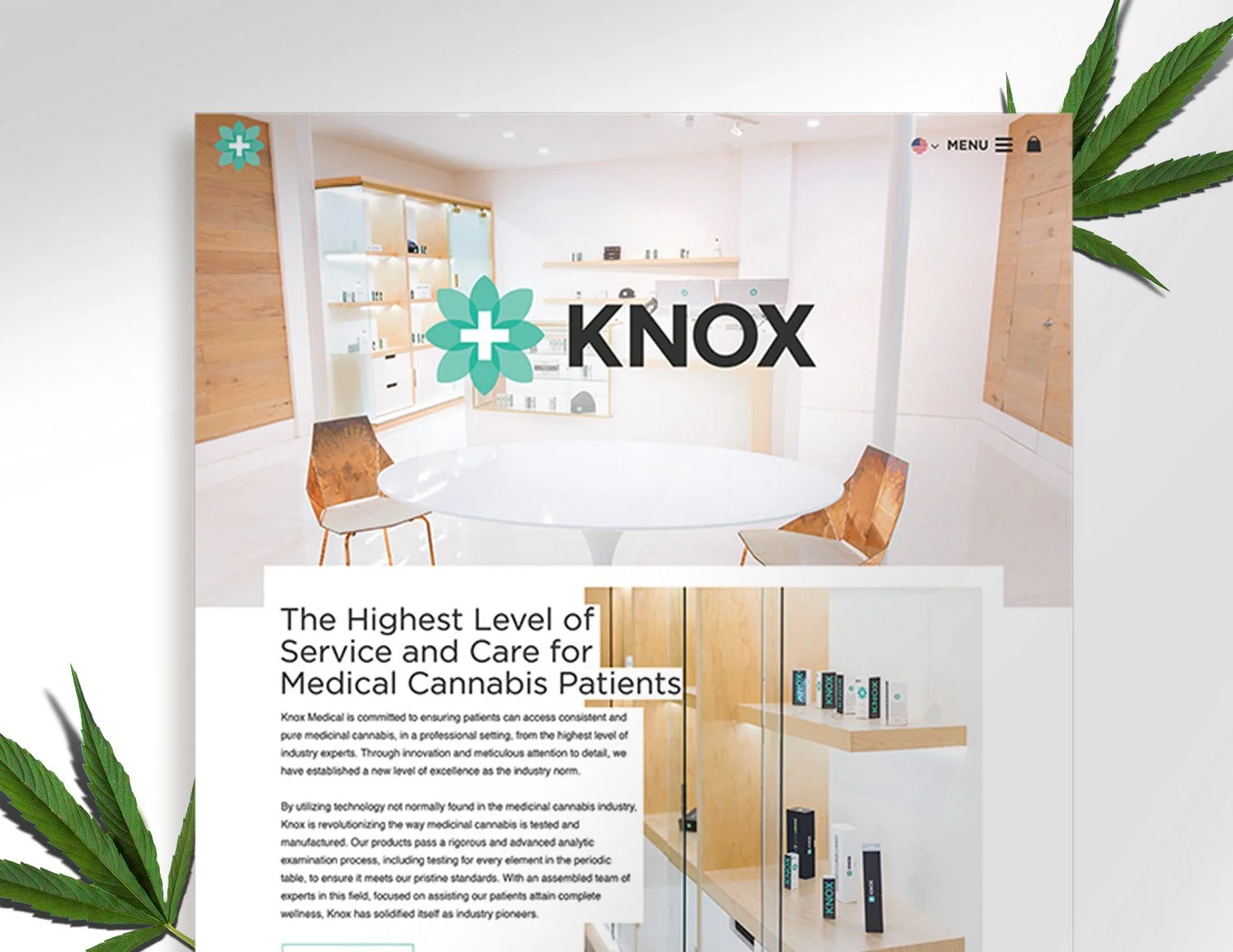
Knox Medical Website & Visual Identity

eLocal B2B Strategy

Turbana Brand Identity Development